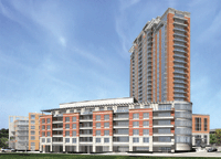
So the "front" entrance will be something like this:
![]()
While the entrance for Metro users will be:
![]()
Wonderful TOD indeed.

While the entrance for Metro users will be:
Wonderful TOD indeed.
I hear you. I think it may have something to do with developers knowing what Clayton will and won't approve architecturally.St.Louis UAB alumni wrote:I like the design but why is it that these new developments feel the need to look like the others around it? For example, Maryland Walk has the red brick/blue glass and it looks just like the other office buildings. The same thing applies to this building...it looks more an extension of the Plaza in Clayton and The Crescent rather than it's own development.
Oh yeah, the Park East Tower is the same. Tan exterior that matches the BJC hospital.
It's getting on my nerves. Maybe I am just being picky.
bpe235 wrote:The glass and modern look will have to wait for the two Centene towers. If they ever get built, those two towers along with this project will really push the clayton skyline east.
Grover wrote:So the "front" entrance will be something like this:
While the entrance for Metro users will be:
Wonderful TOD indeed.
FromTheLou wrote:You know what this development is missing (based on the rendering), STREET PARKING!