like this


^ Hey thanks! Really appreciate the update. Certainly a huge improvement in the appearance of the station. A little surprised they didn’t match it up with the Cortex canopy, but this one looks good just the same.

Render via Matthew Hibbard on Twitter. I don’t think those are turnstiles, maybe dummy gates.
Sent from my iPhone using Tapatalk
We just finished a year (more?) of no blue line service on most of the alignment (east of FP-DeBaliviere) on non-event weeknights due to Cortex construction, then something with the overhead wiring downtown.
It starts again Monday due to this project.
Any idea how long that lasts? I'm assuming the Union Station tunnel work will again result in the same service disruptions.
It'd be nice if they could do more than one project simultaneously rather than constantly making Metrolink half-useless after 8pm for years.
Metro can't even enumerate which specific blue line trains stop and where. Like is the scheduled blue line w/b from Washington Park at 7:47pm running? Because that one will be on the single-tracked alignment after 8pm. It's impossible to even figure out which trains run if you're going somewhere at 8:10pm.
But it doesn't matter much when it's just the poors riding at that hour. Their time is not valuable.
I swear that Metro really milks that whole "no blue line east of FP after 8 pm" thing. There were several times that I rode the metro after 8 through the Union Station tunnel and there was absolutely no sign of work going on.
This station and a few others really need this type of decal on the ground that directs those waiting to board to stand to the side of the doors and allow exiting passengers to get off the train.
https://iliveinthesuburbs.wordpress.com ... eal-metro/
https://iliveinthesuburbs.wordpress.com ... eal-metro/
New canopy is looking pretty stellar. This will be a much better looking station once these improvements are done. Would like to see similar canopies at remodeled Metro stations in the future.
![]()
![]()


Was going to mention this earlier but forgot...there’s some sort of light feature in the tunnel under Kingshighway and the BJC complex. Multicolored light circles projected up along the walls. Not sure if anyone else had noticed...pretty basic, but still kind of cool.
- 667
^ Those multicolored light circles in the tunnel have been there for years. I wish they would add some art to more stations just to give local artists some expose or maybe to give the stations some identity with the communities/districts they serve.
As for the CWE, I can't wait until they finish that new entry way.
As for the CWE, I can't wait until they finish that new entry way.
Metro has a website for all their art installations: https://www.artsintransit.org/art-collection/
The CWE is near the bottom (the red lights are a motion shot). You have missed it before because it seems to often to get turned off when there is a significant construction project on the medical campus, which is most of the time.
The CWE is near the bottom (the red lights are a motion shot). You have missed it before because it seems to often to get turned off when there is a significant construction project on the medical campus, which is most of the time.
I see where you're coming from. On a hot summer day a little more shade would be appreciated.quincunx wrote: ↑Aug 21, 2020Might be a bit too transparent for my taste.
I wonder if the transparency is a product of safety's influence on the design process. Having the shelter panels be clear may improve the perception of safety as there is the sense of more eyes on the platform from the surrounding office buildings and more platform visibility by a security guard if they're standing up at the entrance to the station.
The single entrance/exit used for Cortex was also a bit much in my opinion. It would have been more convenient if it was dual platforms that connected directly to the sidewalk, like Sunnen or Wellston Station. But I get that they want to restrict access/egress to a single point, maximize the number of bystanders (/eyes) on each platform and are basically doing everything they can design-wise to improve safety (real and perceived).
^ Definitely see what you're both saying regarding the canopy. For what it's worth I stood under it for a bit on Friday and once more today and didn't feel too hot or uncomfortable either time. There is a frosted type film on the glass that blocks out some of the brightness and heat. Way more transparent than the other canopies though.
I posted this in the Cortex thread but I'll add it here too. I think a canopy like at Cortex would have been awesome here...even though I do still like the new one:
![]()
I posted this in the Cortex thread but I'll add it here too. I think a canopy like at Cortex would have been awesome here...even though I do still like the new one:

If your designer is not OCD enough, form-function mis-steps like this happen.
Note the two commuters in the first scmayor image who seem to be huddled up to monument signage to get some sense of shelter.
Could have alternated clear and opaque glass
Could have splurged for glass that tinted when the sun came out
It seems we don't even care to give commuters the dignity of respite from the heat as they wait and sweat on the platform for low-frequency service.
I apparently feel strongly about this....
^ Can’t speak for those two in the pic from the other day, but it was 94 degrees today and I stood under it for about 10 minutes waiting for a train and honestly it seemed to do its job just fine. The other 40-50 people standing on the platform didn’t seem to be bothered either. It’s not like it’s just plain clear glass.
A little color would have been a cool touch to add some visual interest into what is a pretty bleak environment. The surrounding buildings are nice, but it very much feels like being in a weedy, gravel-lined ditch sometimes.
Something like the canopy at Centene (but without getting an expensive artist involved):
https://claycorp.com/project/liam-gilli ... ene-plaza/
![]()
![]()
Something like the canopy at Centene (but without getting an expensive artist involved):
https://claycorp.com/project/liam-gilli ... ene-plaza/


I'm not sure that's a fair assessment. They are being rather OCD about ensuring that form is following function. It's just a very specific function that they are pursuing - maximizing safety and visibility. Alternating opaque panels, panels that turn dark in sunlight, panels that are richly colored, all would have impacted visibility of the platform from the top of the entrance/stairs and from the office windows overhead.imran wrote: ↑Aug 24, 2020If your designer is not OCD enough, form-function mis-steps like this happen.
Note the two commuters in the first scmayor image who seem to be huddled up to monument signage to get some sense of shelter.
Could have alternated clear and opaque glass
Could have splurged for glass that tinted when the sun came out
It seems we don't even care to give commuters the dignity of respite from the heat as they wait and sweat on the platform for low-frequency service.
I apparently feel strongly about this....
Perhaps it's not ideal from an aesthetic or comfort standpoint (although it's good to hear anecdotally that they provide some respite from glare), but seems to be optimized for the function that Metro is prioritizing over all else right now.
That last sentence summarizes it for me. Designing around a single concern (visibility in this case). Bet you there are a dozen design solutions here that could have preserved visibility and better optimized commuter comfort. I am aware though that most people won't even notice.wabash wrote: ↑Aug 25, 2020I'm not sure that's a fair assessment. They are being rather OCD about ensuring that form is following function. It's just a very specific function that they are pursuing - maximizing safety and visibility. Alternating opaque panels, panels that turn dark in sunlight, panels that are richly colored, all would have impacted visibility of the platform from the top of the entrance/stairs and from the office windows overhead.imran wrote: ↑Aug 24, 2020If your designer is not OCD enough, form-function mis-steps like this happen.
Note the two commuters in the first scmayor image who seem to be huddled up to monument signage to get some sense of shelter.
Could have alternated clear and opaque glass
Could have splurged for glass that tinted when the sun came out
It seems we don't even care to give commuters the dignity of respite from the heat as they wait and sweat on the platform for low-frequency service.
I apparently feel strongly about this....
Perhaps it's not ideal from an aesthetic or comfort standpoint (although it's good to hear anecdotally that they provide some respite from glare), but seems to be optimized for the function that Metro is prioritizing over all else right now.
- 2,940
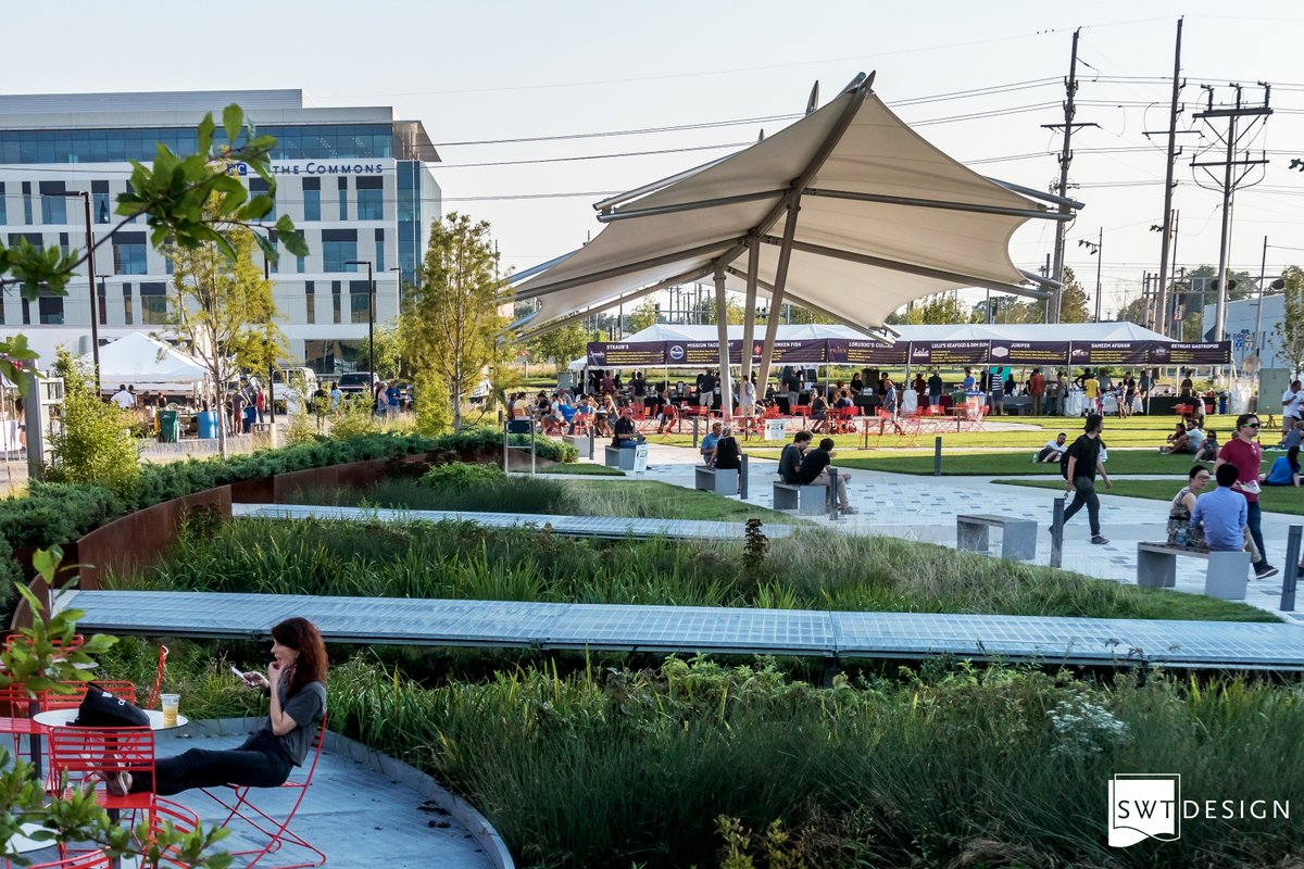
Guys, the canopy for the Cortex Metrolink station was designed to mimic/mirror the canopy in Cortex Commons, which it does. It was a conscious decision made in part to differentiate that station from all the others, like art work. And that's the reason why it's different from the BJC/CWE station canopy.
![]()
^ I understand why they selected the canopy at Cortex. But BJC helped fund both stations and they’re in the same neighborhood. Just a little wishful thinking on my part, but the new one at CWE looks great as far as I’m concerned.
Not sure why the canopy is transparent... half the purpose of a cover is for shade from the brutal St. Louis summertime sun.
- 2,940
^ My guess would be to look up at the high rises surrounding the station, which also lessen direct sunshine exposure to the station.

https://medicine.wustl.edu/news/7-5-million-redesign-of-cwe-metrolink-station-completed/
It’s definitely a much better station with the new design (I use it every weekday), but I sure wish that there had been a way to make the platform wider.
It’s definitely a much better station with the new design (I use it every weekday), but I sure wish that there had been a way to make the platform wider.