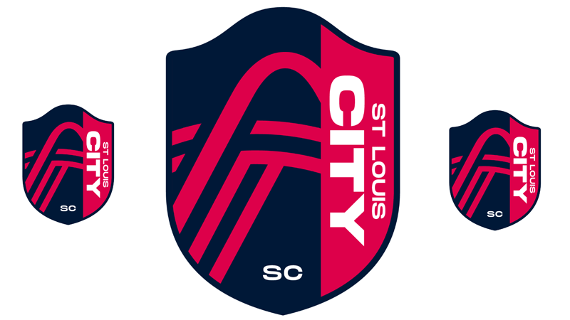
^I would guess Missouri River meets Mississippi just like the city flag?
^ right. Line going left to right is the Mississippi. One coming from lower left is Missouri.
As if you were in a plane looking East.
As if you were in a plane looking East.
- 340
^looks like the confluence. All of that build up and they went basic.
I can live with this. Looks sorta-kinda European, without trying too hard.
- 399
Maybe we should merge and we would be one and the same?kipfilet wrote: ↑Aug 13, 2020County people having a meltdown on Twitter is fun to watch
I like it. Probably can't drive the point home any more obviously with a name like this that this is yet another St. Louis *CIty* amenity that is an asset to the entire region and enjoyed by the entire region. The logo is more than acceptable IMHO as well.
- 805
The rivers form a big T on the crest, and the arch feels like it could swoop into an S just off the crest, is there anything in there that could give an L?
Sent from my iPhone using Tapatalk
Sent from my iPhone using Tapatalk
LOVE IT. Well done.sc4mayor wrote: ↑Aug 13, 2020St. Louis City SC it is.
https://www.stltoday.com/sports/soccer/ ... e-breaking
- 9,675
They got a fleet of branded Audi’s going around town doing promo shoots, the R8 is at City Museum

^Would've been nice if they had used cars built in Wentzville. Just sayin'.
Love the crest. Somewhat surprised there's no yellow in it, but it's still pretty b**chin'.
- 99
According to the Post Dispatch, Energy Yellow and also Arch Steel Grey are supposed to be part of the color scheme as well. I’m guessing they’ll be featured more in the actual uniforms. Speaking of which. When will we see those?EssTeeEll wrote:Love the crest. Somewhat surprised there's no yellow in it, but it's still pretty b**chin'.
Sent from my iPad using Tapatalk
I am happy with the name. I like that is has SC and not FC.
I do wish the red was more of a darker red than a fuchsia or whatever it is.
I do wish the red was more of a darker red than a fuchsia or whatever it is.
Nah....there are no cars nearly that cool built in Wentzville.framer wrote:^Would've been nice if they had used cars built in Wentzville. Just sayin'.
Nice! Thanks for that tidbit.FrankRider wrote: ↑Aug 13, 2020According to the Post Dispatch, Energy Yellow and also Arch Steel Grey are supposed to be part of the color scheme as well. I’m guessing they’ll be featured more in the actual uniforms. Speaking of which. When will we see those?EssTeeEll wrote:Love the crest. Somewhat surprised there's no yellow in it, but it's still pretty b**chin'.
Sent from my iPad using Tapatalk
Agreed on preferring SC to FC. As others have pointed out the "Real", "United", "Inter" and even "FC" usage starts to feel like it's trying too hard to be something it's not - a 100 year old European club. While there is Manchester City, Leicester City, Birmingham City, Cardiff City, etc.... it seems less forced since it's already the name of the City.jshank83 wrote: ↑Aug 13, 2020I am happy with the name. I like that is has SC and not FC.
I do wish the red was more of a darker red than a fuchsia or whatever it is.
I think they really got this one right. River city reference - check, Arch - check, emphasizing the City - check, avoiding the nauseating debate around the merits of King Louis IX's reign - check, a design that one could easily see on a hat or golf shirt without being too loud - check, not adopting some meaningless innocuous name like "Impact", "Galaxy" or "Dynamo" - check.
- 991
Audi is also an official MLS partner, so there's zero chance they would have used any other vehicles.
Here are a few notes about team crest:
- "SC" can stand for both "Soccer Club" and "Soccer Capital"
- Multiple nods to the Gateway Arch, with the rounded top and clear arch shape inside the shield
- The lines through the Arch represent the three rivers that meet in St. Louis: Mississippi, Missouri and Meramec
Correction - the lines through the Arch represent the three rivers that meet in St. Louis: Mississippi, Missouri and Des Peres.lobot3000 wrote: ↑Aug 13, 2020[li]The lines through the Arch represent the three rivers that meet in St. Louis: Mississippi, Missouri and Meramec[/li]
From the kmox interview.
For real though, the arc of the "top" river is pretty consistent with the shape of St. Louis. That might be KMOX or a misguided PR person taking liberties. It really looks like (stylized) the Missouri flowing into the Mississippi - similar to the STL flag.
I particularly dislike "Real" because it is a direct reference to the Spanish Monarchy. Makes absolutely no sense in a country like the US.wabash wrote: ↑Aug 13, 2020Agreed on preferring SC to FC. As others have pointed out the "Real", "United", "Inter" and even "FC" usage starts to feel like it's trying too hard to be something it's not - a 100 year old European club. While there is Manchester City, Leicester City, Birmingham City, Cardiff City, etc.... it seems less forced since it's already the name of the City.jshank83 wrote: ↑Aug 13, 2020I am happy with the name. I like that is has SC and not FC.
I do wish the red was more of a darker red than a fuchsia or whatever it is.
I think they really got this one right. River city reference - check, Arch - check, emphasizing the City - check, avoiding the nauseating debate around the merits of King Louis IX's reign - check, a design that one could easily see on a hat or golf shirt without being too loud - check, not adopting some meaningless innocuous name like "Impact", "Galaxy" or "Dynamo" - check.
I am all in! I would like to see a team merchandise store downtown as soon as possible. It would give people extra incentive to buy gear and pay attention to the stadium construction. I bought STL City SC merch today and the estimated delivery is Sept 22nd....that’s a ways off.
Happy with the name. Like the third of the crest to the right.
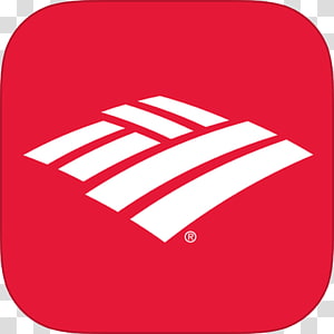
But the curve of the Arch bothers me. It's just wrong, from any angle. And overall, the left two-thirds of the crest looks like a regional bank or community college logo.
But the curve of the Arch bothers me. It's just wrong, from any angle. And overall, the left two-thirds of the crest looks like a regional bank or community college logo.
- 99
urbanitas wrote:Happy with the name. Like the third of the crest to the right.
But the curve of the Arch bothers me. It's just wrong, from any angle. And overall, the left two-thirds of the crest looks like a regional bank or community college logo.

I looked at team crest around the league and while many do use a two color crest, many incorporate three and even four of their team colors. So I’m not sure why they’d choose to not at least make the arch line grey. This would add some distinction to the river lines and make that left side pop more.
Sent from my iPad using Tapatalk