YIMBY might be my new favorite acronym. 
- 249
Hi. Public details on the exact composition of what RoadCrew will and won't consist of have been thin. In hindsight, I should have withheld commentary, which was in no way meant to knock RoadCrew, about the proximity to A&M until they released more info about their services.
Sounds like the two businesses could be somewhat complimentary. I'm excited to see what unfolds in the space period. It's here, so regardless of anyone's feelings on incentives/design, etc., I think those of use in the neighborhood (I live a block away), are just happy to see the increased retail activity on the Morgan Ford strip. My initial concern was borne simply out of my concern and appreciation for the business community already there, not an sort of NIMBY-ism.
Hope everyone has a good extended weekend!
I don't see Road Crew being a huge issue to A&M. A&M is pretty well known and sits at the intersection of two major streets.
I wanted to like this building. The renderings looked really good, but the finished product just looks dumb.
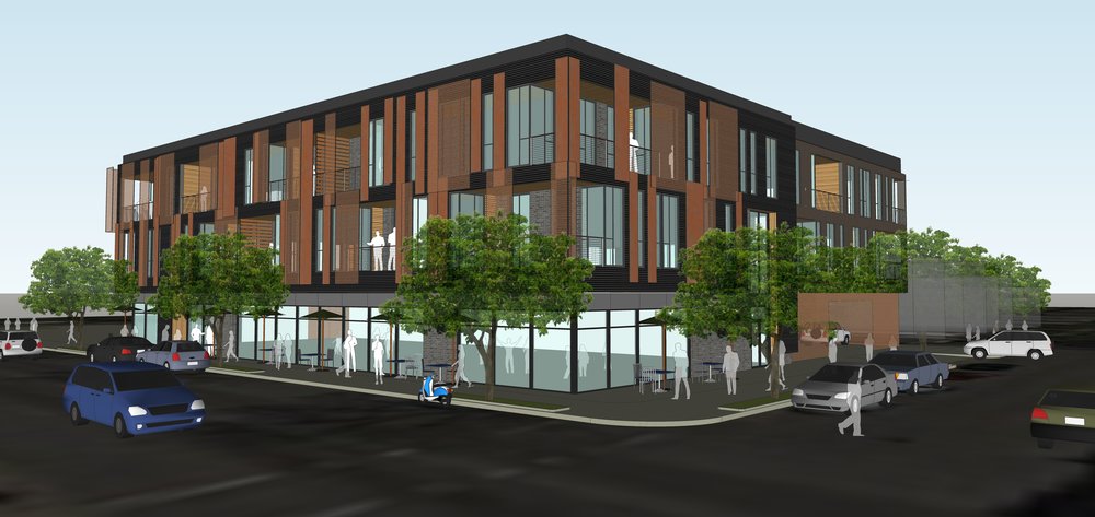
It's grown onto me since my earlier criticisms. It is much better than that sh*tty car wash that once occupied the site. It also adds people to the neighborhood. 26 apartment units aren't that much but it helps fulfill a need for luxury apartments in Tower Grove South.framer wrote:I wanted to like this building. The renderings looked really good, but the finished product just looks dumb.
- 9,541
Not to mention the sidewalk is already stained from those steel panelsframer wrote: I wanted to like this building. The renderings looked really good, but the finished product just looks dumb.
You mean corrugated metal panels that make it look like a shipping container aren't an attractive facade option?
- 2,386
It definitely fits in well with the neighborhood and as it has "weathered" keeps looking better IMO. 2/3 retail already leased is great. Seems like this has been quite successful. Hopefully they can get the infill project a few blocks South going. Doing something with the 7/11 lot would be fantastic longer term as well. A similar building to this would be most welcome.
The building a block South is still a ways off. Especially with the ongoing economic uncertainty but MOFO has been a huge success. All 26 apartments are leased and 2 retail spaces. Nearly 100% less than a year after welcoming the first residents. Truly amazing.newstl2020 wrote: ↑Mar 28, 2020It definitely fits in well with the neighborhood and as it has "weathered" keeps looking better IMO. 2/3 retail already leased is great. Seems like this has been quite successful. Hopefully they can get the infill project a few blocks South going. Doing something with the 7/11 lot would be fantastic longer term as well. A similar building to this would be most welcome.
For future projects, I would like to see the auto repair shop at Arsenal and Morgan Ford demolished and building into a nice, mixed-use building. Imo's should also go and have a 3-story apartment building built on that parcel. 7-11 is on the list as well. After a while, maybe the Vintage Habasashery Building can be expanded onto the parking lot and the side, grassy lot and have a few apartments added there. The ZX Station at Fyler and Morgan Ford could be demolished as well for a new building. The parking lot at Morgan Ford and Hartford would be a good site for a 3 or 4-floor building with single floor condos. And while I'm at it, that "L" shaped plaza between Wyoming and Connecticut could honestly go for a better building (I was thinking single floor and retail-oriented).
Morgan Ford, as well as Tower Grove South, has a lot of potential.
That is fantastic. I also agree with others...I wasn't crazy about the look while it was being built, but it actually looks pretty solid today, the panels have aged fairly well...so far. A welcome addition, even more so with the leasing numbers.chriss752 wrote: ↑Mar 29, 2020The building a block South is still a ways off. Especially with the ongoing economic uncertainty but MOFO has been a huge success. All 26 apartments are leased and 2 retail spaces. Nearly 100% less than a year after welcoming the first residents. Truly amazing.
I remain somewhat disappointed in the outcome of this one compared to the rendering (and yes I know renderings are oftentimes far from final):
![]()
![]()
Don't get me wrong, I'm glad it was built and as-is it is a very positive contributor to the neighborhood. the COR-TEN mesh panels look great. But a number of design decisions lessen the overall look to my eye.
I don't like pushing the fascia out (replacing the previously-unbroken balcony) on the corner and along Connecticut; it breaks up the rendering's nice horizontal lines and detracts from the overall look. And the panels tacked on to the wall face there just look superfluous. If you're going to break up the lines, use a different material on that corner and maybe bump it out slightly to make it a design feature - as it is it seems half-done. The change also reduced the window-to-wall ratio, which i think further detracts from the look.
I know this is totally a personal opinion, but while I'm generally fine with corrugated metal as a finish material, for this building I much prefer the 'grey pedestal supporting a dark box' in the rendering to the lighter color from the unpainted metal. I can't quite put a finger on it, but despite the fact that both materials are in the raw it feels not as well color-matched - the COR-TEN weathering seems better suited to the dark brown color IMO.
This is true of both the rendering and the finished product: the building has sort of an 'anti-cornice' that's stepped back from the corrugated metal wall face. It reminds me of the grand old buildings whose elaborate cornices were ungracefully removed rather than repaired. this design makes it look like this new building also used to have something more elaborate there but was stripped away and never replaced, which reads to me as neglectful maintenance by design. I think even a minimalist cornice - a simple square bump-out projecting out slightly past the tops of the COR-TEN panels would look better. The 3172 sign is a really nice addition, however.
The back half of the building was a pedestal floating over the parking spaces. The only first-floor structure was a see-through screen of some sort. The finished product is likely much more secure (and I assume climate-controlled), but the solid blank wall face just looks unfinished and a bit oppressive from a human scale. The the corrugation does provide at least a little texture, and orienting it vertically here (as opposed to horizontally in the rest of the building) does add some visual interest. That the corrugated pattern of the first-floor panels don't exactly line up with the 2nd-3rd-floor panels (at least as seen from Street View) and the simple seam between the two makes it look like it was an afterthought or a post-construction alteration. IMO this bit here is particularly inelegant:
But it's not far from acceptable - even just moving that 3172 MOFO sign from the middle of the building to the garage corner (see the above pic) would help by adding a feature to a featureless part of the wall, I think.
OK, I'm done now, promise. This has been back-seat design critiquing from a non-expert. I am available for anyone else who wants to know how they did it wrong.
-RBB
Yeah, I was excited when I first saw the rendering, but the finished product is very disappointing to me. Too cheap, too trendy, too gimmicky.
- 6,118
^I wonder if they could wash them now that the cor-ten has rusted up properly.
Per the property website, units 204 and 301 are available. Both are two bedroom units.
- 2,419
Don't know where else to put this, so move it if it's better elsewhere.
What is going on with the 7-Eleven near MOFO?
Renovations?
Sent from my SM-F711U using Tapatalk
What is going on with the 7-Eleven near MOFO?
Renovations?
Sent from my SM-F711U using Tapatalk
- 3,762
^ and then returning to fill storefront space in a new multi-story, multi-use, minimal setback structure.
This was issued on January 24th.quincunx wrote: ↑Jul 17, 2021$225k building permit application submitted for a restaurant
- 2,419
The 7-Eleven is becoming a restaurant?
Interesting.
Sent from my SM-F711U using Tapatalk
Interesting.
Sent from my SM-F711U using Tapatalk
- 2,053
I was excited too until I saw them pulling cases of bottled soda out of one of them yesterday…


