I was diving down one of my usual local history rabbit holes and stumbled across a quite nice art map of our fair city and thought I might share it. I couldn't find a thread dedicated to maps, which is a tad surprising seeing as I know I'm not the only one who obsesses over them and how many interesting ones exist. So . . . here's a new thread where we can post our favorite maps and talk about why we like or dislike certain maps.
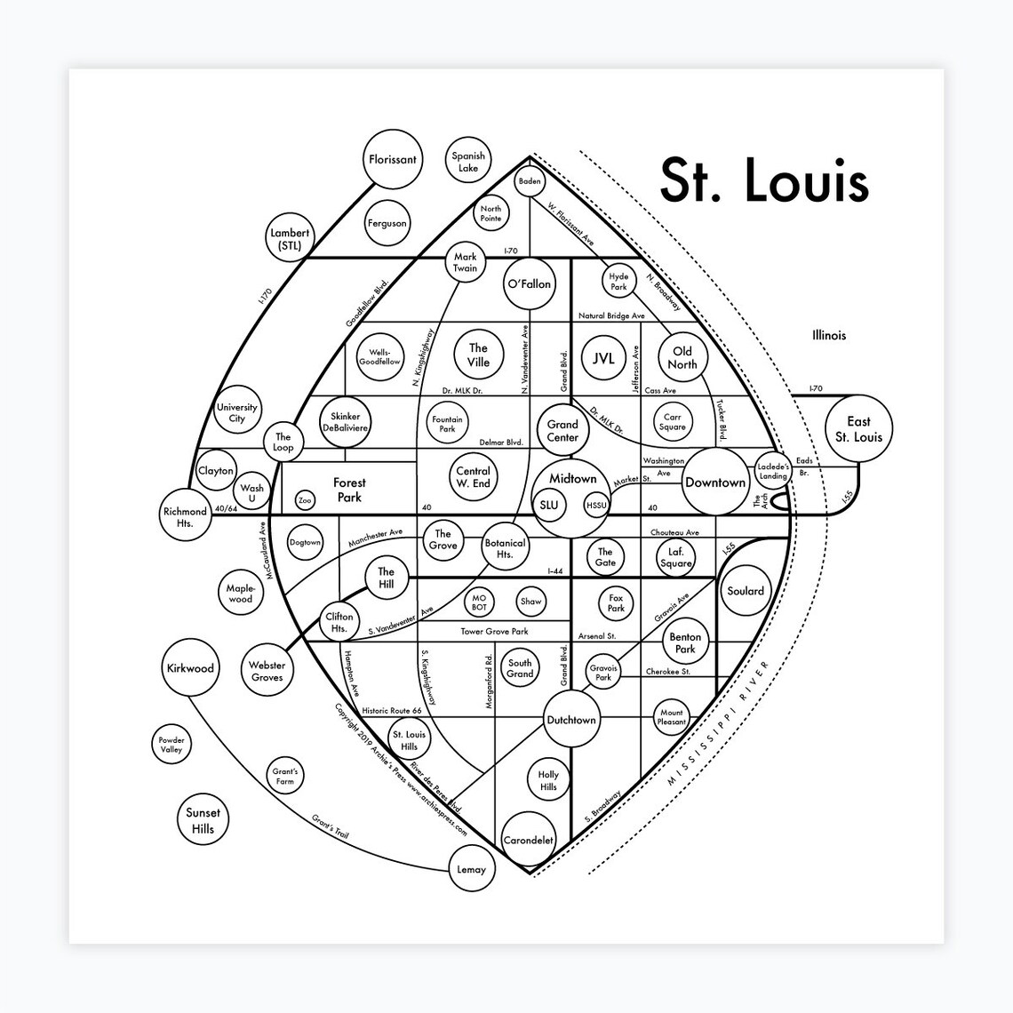
The map that got me thinking is an art map of St. Louis neighborhoods. I've been known to sharpen up my axe on that topic from time to time when the hairs need splitting. This map certainly has some of the corporate neighborhood names that annoy me, but it's generally well done and it has some of the vernacular names missing from the official map. It nicely reflects how I think neighborhoods actually work. Instead of boundary lines neighborhoods are suggested by names placed in circles of varying size suggesting their relative prominence. The circles seem to generally be pretty well placed to suggest the approximate "center of gravity" of a given neighborhood. The map is quite stylized, but there are plenty of roads and landmarks to orient you. It's more conversation piece than navigational aid, of course. But I'd say the author put some care and thought into the thing and did his homework.
![]()
Since it's an art piece you can of course buy a print at either the author's etsy store or his website.
Anyway, let's talk map. What they're for, how they work, how you might make one and why. What we like. What we hate. That sort of thing.
The map that got me thinking is an art map of St. Louis neighborhoods. I've been known to sharpen up my axe on that topic from time to time when the hairs need splitting. This map certainly has some of the corporate neighborhood names that annoy me, but it's generally well done and it has some of the vernacular names missing from the official map. It nicely reflects how I think neighborhoods actually work. Instead of boundary lines neighborhoods are suggested by names placed in circles of varying size suggesting their relative prominence. The circles seem to generally be pretty well placed to suggest the approximate "center of gravity" of a given neighborhood. The map is quite stylized, but there are plenty of roads and landmarks to orient you. It's more conversation piece than navigational aid, of course. But I'd say the author put some care and thought into the thing and did his homework.
Since it's an art piece you can of course buy a print at either the author's etsy store or his website.
Anyway, let's talk map. What they're for, how they work, how you might make one and why. What we like. What we hate. That sort of thing.

