What license plate do you like best?
- 5,433
STLbiggestfan wrote:The tourism logo would look great on a plate. Lots of other states have used license plates to promote tourism, so why not us? Besides, the state already HAS the logo. The three designs look pretty uninspired--don't send much of a message.
Many states have used their tourism logo on their plates. Anyone remember this gem from Kentucky?
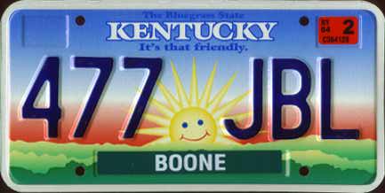
The plate carried the "It's that friendly" motto, and I suppose that the smiling sun was supposed to convey that message somehow. It was often referred to as the Teletubbies plate, as the smiling sun reminded many motorists of the smiling sun on that bizarre children's show. It was so reviled, that it was replaced after less than three years, when Kentucky usually redesigns plates on a five-year cycle.
On the redesigned plates, Kentucky went back to what it does best, on the racetrack and on graphic license plates: horses.
Compared to the Teletubbies plate, I think our tourism logo would work much better. Anything would.
Speaking of seals, the state flag/seal has two bears on it. I guess they represent the two bears that occasionally get lost and stumble in from Arkansas. You would think a state that chooses to represent itself with bears would make some kind of effort to bring bears back into our forests. Especially considering the brief, but brilliant success of our steamboat reintroduction program: we even got a pair of steamboats to mate in captivity......first time ever. Too bad Blunt blocked the steamboat stem-cell research initiative and they all died from congenital boiler defects. I tell you those out-staters screw St. Louis every time.
- 5,433
This is basically what I had in mind for the new Missouri plates. If I wasn't such a Luddite, I'd add a fade from white to blue on the plate background, so it didn't look so plain. Or it could be from white to blue to green, like the current plates. Anyway, I think the state's tourism logo looks far better than the other abstract river-themed plate designs.

I like it. I can't imagine why this hasn't occurred to the powers that be. That logo is really perfect. You should email your example to the DOT or DOR or whomever is busy screwing this thing up.
- 5,433
^ Thanks! The funny thing is, I made this while I was at home eating lunch today. I cooked it up faster than I could heat up my leftover spaghetti! I'm not sure why the powers-that-be didn't think of using this tourism logo, or why they couldn't come up with anything better than the three mediocre options we were given.
I'm a little concerned, because after reading some polls and comments in rural Missouri newspapers, it looks like those folks really like the bluebird plate. I think it's hideous, with too many details (state outline, bluebird at the bottom, vertically-positioned Show-Me State on the RH side of the plate).
As I said before, I also think the DOR should strongly consider keeping the space for renewal tabs in the center of the plate, just because I think a lot of (esp. older) Missourians are going to put them there anyway since they've been doing just that for the majority of the last 30 years. Some people started incorrectly putting them there on the current plates when they were first issued in the late 1990s, only for the state to recommend a couple of years later that all motorists place renewal tabs in the center once tab theft became a serious problem.
As you suggested, I'll email my suggestions to the state later today.
- 5,433
Relief may be in sight for victims of car tag theft
By Derek Kravitz
POST-DISPATCH JEFFERSON CITY BUREAU
03/02/2007
JEFFERSON CITY — Relief might be in sight for thousands of city drivers whose license plate stickers have been cut, ripped or stolen by black market tag thieves.
The Missouri Senate voted 33-0 to give first-round approval Thursday to a bill allowing drivers to show notarized affidavits to receive free replacement stickers. Currently, you need to file a police report to have the $8.50 replacement fee waived.
Senate Minority Floor Leader Maida Coleman, who sponsored a law two years ago that allows car owners replacing stolen tabs to receive two sets of replacement tabs at no cost, said the current system is needlessly time-consuming and costly.
"We're eliminating a step that makes it easier for drivers to get back on the road," said Coleman, D-St. Louis.
Read More>>>
- 10K
So tags don't ever get stolen in the County? Didn't know this problem ONLY occurred in the city. 
- 5,433
^ I noticed that too, and I beg to differ. The last time someone cut my plates, I was shopping in Crestwood. On Christmas Eve.
I occasionally read outstate newspapers online, and a quick scan of the crime reports in papers from places like Cape Girardeau, Columbia, Springfield, etc. shows this trend is not exclusive to the city proper. Parts of St. Louis County have their share of plate and/or tab theft as well.
I occasionally read outstate newspapers online, and a quick scan of the crime reports in papers from places like Cape Girardeau, Columbia, Springfield, etc. shows this trend is not exclusive to the city proper. Parts of St. Louis County have their share of plate and/or tab theft as well.
- 1,768
My girlfriend and I just had someone steal the entire PLATES off our car.
- 5,433
Get used to this, Missouri residents.
In a year or two, you'll put a pair of these on your car(s) and see many more in traffic, whether you want to or not.

Never underestimate the questionable taste of Missourians, because over 56% of those that voted chose the bluebird, with the other two choices getting less than 25% of the vote. Couldn't these people just buy conservation plates if they're so into bluebirds?
I'm trying to decide which aspect of the plate I like the least. Is it the color fade that looks like a Web 2.0 design? How about the gratuitous Missouri outline in the background, since most Missourians can't find their state on a map anyway? Is it the puny bluebird clinging for dear life to the bottom of the plate? No, it must be "Oh sh*t, I forgot, an arcane and pointless law requires us to put Show Me State on plates, and there's already a bluebird on the bottom, so let's cram our silly state slogan onto the side".
Oh well, at least some blue-haired lady in Fredericktown will think it looks cute on the back of her Grand Marquis.
I don't even like specialty or personalized plates, but now I'm thinking about getting some at renewal.
In a year or two, you'll put a pair of these on your car(s) and see many more in traffic, whether you want to or not.
Never underestimate the questionable taste of Missourians, because over 56% of those that voted chose the bluebird, with the other two choices getting less than 25% of the vote. Couldn't these people just buy conservation plates if they're so into bluebirds?
I'm trying to decide which aspect of the plate I like the least. Is it the color fade that looks like a Web 2.0 design? How about the gratuitous Missouri outline in the background, since most Missourians can't find their state on a map anyway? Is it the puny bluebird clinging for dear life to the bottom of the plate? No, it must be "Oh sh*t, I forgot, an arcane and pointless law requires us to put Show Me State on plates, and there's already a bluebird on the bottom, so let's cram our silly state slogan onto the side".
Oh well, at least some blue-haired lady in Fredericktown will think it looks cute on the back of her Grand Marquis.
I don't even like specialty or personalized plates, but now I'm thinking about getting some at renewal.
ThreeOneFour wrote:...I'm trying to decide which aspect of the plate I like the least. Is it the color fade that looks like a Web 2.0 design? How about the gratuitous Missouri outline in the background, since most Missourians can't find their state on a map anyway? Is it the puny bluebird clinging for dear life to the bottom of the plate? No, it must be "Oh sh*t, I forgot, an arcane and pointless law requires us to put Show Me State on plates, and there's already a bluebird on the bottom, so let's cram our silly state slogan onto the side"....
I don't even like specialty or personalized plates, but now I'm thinking about getting some at renewal.
I think I despise all of the design elements equally. The state outline is so thin it might as well not be there, but it's just enough to annoy you into wanting to figure out "what is that?" The bird and hawthorn are too small and too cute, and Show-me-State is in a place where it looks like a vehicle designation.
I've had the generic personalized plates since 1999. Guess it's time for me to cough up some bucks for the SLU alumni association!
PS: What's with the hyphen in the lower left corner of the new plate? Is that supposed to remind people "don't put your year sticker here!"
You can always choose a special plate with a St. Louis theme:
![]()
![]()
![]()
![]()
...or show your love for Team America:
![]()
![]()
...or go further than the new plate in showing your support for bluebirds, or really bad graphic design:
![]()
![]()


...or show your love for Team America:


...or go further than the new plate in showing your support for bluebirds, or really bad graphic design:


- 139
WOW the new plates are horrible. Not really surprised considering the state we live in.
Time for a Mizzou alum plate or a StLouis Cardinals plate.
Time for a Mizzou alum plate or a StLouis Cardinals plate.

- 11K
I think I heard that the month/year stickers are printed onto the plate and then you only add a year sticker, and it's in the middle of the plate.
- 835
Leave it to Missourah to choose the lamest design. I'm not a bit surprised.
^ Yeah pretty lame, but really how could you not go wrong. They all sucked.
Anyone old enough to remember when you got new plates every single year? I'm only 37 and remember it.
- 5,433
^ I'm 32, so I barely remember that. I do recall helping my dad put the old maroon plates on the Beetle for the first time when I was five, and the pile of license plates that the Beetle wore earlier in the 1970s. I collect different auto-related items, so I actually have a few of those plates hanging in my garage. Those 1970s Missouri plates were funky. I liked them.
Jive, I'm not surprised either. It seems like lately, when Missourians have their say, I rarely like the outcome. (I bet there weren't too many votes for the bluebird here in Cardinals Nation.)
As someone else suggested here, I submitted my idea for plates to the DOR director, Trish Vincent. I received a polite "thanks but no thanks" response, along with an explanation that law enforcement officials were looking for the most legible plates possible. If that's the case, we should've had to choose from the ribbon or reflection, because that bluebird plate is easily the busiest design in our state's history (even busier than some current specialty plates). I wonder what the state and local LEOs will think of it.
I was no fan of the other two designs, but at least the ribbon design didn't have a color fade or graphics o the bottom. I like my plates relatively plain, like current issues in California, Michigan, or European plates.
Other details I gleaned from my email exchange...
- The new plates will be issued as soon as summer 2008. Inventory of current plates, and possible plate combinations, are running low.
- There may be some minor tweaks to the design as LEOs test the plates for visibility.
- New plates will have six characters, like all previous Missouri plates. The month will be embossed in the upper LH corner, and the year sticker will be in a recessed box in the plate center, the same setup that the old maroon plates had. (I actually prefer this location for renewal tabs, but it'd look better with no color fade or background graphics.)
- The numbering system will be determined by law enforcement's preferences, and no decision has been made yet.
I'm glad my current plates are up for renewal before the new ones will be distributed, because I think I can renew next year and not have to get new plates until 2010. I never thought I'd get so attached to the current plates.
- 10K
I seriously think I am going to get that vanity plate. Might as well send a few bucks to the alma mater while avoiding the new design.
Speaking of the old plates, we have a Missouri plate from 1976 that features a bicentennial logo at the top - it's pretty cool.
Speaking of the old plates, we have a Missouri plate from 1976 that features a bicentennial logo at the top - it's pretty cool.
- 5,433
Tysalpha, the hyphen in the lower LH corner was where the year sticker was supposed to be placed originally. Due to feedback from the public, the DOR has changed course and decided to keep the stickers in the center on regular plates, where they were on the maroon (1979-1997) plates and on current Missouri plates issued in the last two or three years.
DeBaliviere, I have a couple of those bicentennial plates in my small Missouri plate collection. They are cool.
I've been renewing the plates on my Mazda each year- I didn't opt for the two-year renewals since thieves like to take my stickers at least once a year anyway. My plates are due in February, and I got new plates when I renewed them a few weeks ago. Now I think I'll get the two-year renewal next year, so I won't have to decide what to do about the new plates until Feb. 2010. Maybe the bluebirds won't annoy me as much by then. My license frames (WashU on the back, Bommarito on the front) might cover the bluebird and oddly-positioned state slogan anyway.
Normally I couldn't care less about license plates, but I think we could've had a much better design, or we could've gone with the "less is more" approach of the other two designs.
JivecitySTL wrote:Leave it to Missourah to choose the lamest design. I'm not a bit surprised.
I'm not sure there is a "lamest" design... there were all lame.
I would like to see some St. Louis specific plates. How about something playing off our crime? St. Louis Resident: I'm coming for your T.V.! Maybe, Missouri: Underfunding Schools!
Well, maybe better for a bumper sticker.
Anyway, these are all quite ugly.
Well, maybe better for a bumper sticker.
Anyway, these are all quite ugly.
- 8,922
IMO, I really couldn't care less about the plates as longs as they aren't flamboyant. As long as they are plain and don't distract, they'll look fine on my vehicle. Anyone else share my view?