
I think I like the the new design. I’m leaning yes—in either a ‘post Soviet-bloc’ or cute ‘delivery app logo’ kinda way. Not sure. But do I know I’ve always disliked the current design. (Not the ‘M,’ but the rolling stock.) Reminds me too much of the (in my opinion) rather hideous Amtrak ‘Pepsi can’ paint scheme.
- 1,316
Eh, it just looks kind of tired and dated to me. Probably the solid cheatline - those should've stayed in the 80s.
Maybe it looks better in person?
Maybe it looks better in person?
Love the new METRO logo and the train.
When will METRO roll this out fully?
I would love to hear new automated announcements and video screens added on the trains.
I would also love to see The Loop Trolley integrated into the system and the system map.
In addition, I *think* METRO will stop using the "Metrolink" name (hopefully) - just make the entire system METRO - mostly everyone calls the rail system METRO anyway. They are slowly, seemingly, using just METRO on things. Just like MARTA in ATL changing to "THE ATL" on their trains because "Marta" just is old and often is racially used and/or not a "positive" connotation.
Any info on timeline?
- 667
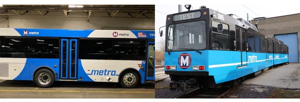
I drove by Metro's maintenance shop this near I-64 and Compton this evening and saw this Metro bus painted in the new STL Metro scheme. Judging by the bus' fleet number 73xx, this bus is a 2019/2020 model. I am surprised Metro went back to buying some 30 footers. I was told operating them was more costly than running a 35 footer or 40 footer.
I must say that this new scheme is different! As for roll out I am thinking sometime in January 2020.
I must say that this new scheme is different! As for roll out I am thinking sometime in January 2020.

 sc4mayorsc4mayor
I like it!
Looks great, thanks for posting! I wonder if that’s the bus only scheme or if the trains might get that design. Very cool in either case,
- sc4mayorsc4mayor
^ There is a picture of the train design on page two. It looks great too!
This is a great video of STL Metro trains (I believe this is on the Red Line maybe near STL International Airport running along I-70).
I always think a BIG city has to have a rail system (not just LRT street system or streetcar) but a fast moving rail transportation system like ours - we are lucky to have built Metro over 30 years ago. You look at Atlanta and MARTA has 48 miles of rail and St. Louis has 46 miles of rail. Not too bad!
I always think a BIG city has to have a rail system (not just LRT street system or streetcar) but a fast moving rail transportation system like ours - we are lucky to have built Metro over 30 years ago. You look at Atlanta and MARTA has 48 miles of rail and St. Louis has 46 miles of rail. Not too bad!
Not to be technical but, planning started in the mid 1980's and final alignment and plans by 1988/89. Construction started in 1990 (30 years ago) and the system opened the first line (Red) in 1993.
The reason our Metro system runs like a heavy rail system (no street running/flush platforms and faster operation) is because at the time it was one of the first LRT systems to be built in the USA on a large scale. I remember reading an article in the 1988 PD (which I have somewhere..the actual paper I kept because they did an entire section on it) that they were going to build the transit system to be fast and efficient and the subway tunnel stations would have to feel bright and welcoming to entice any "St. Louisian to go into a hole". I remember that quote and thought it was funny. Anyway, I think Metro (rail) is one of STL's greatest assets as a big city.
The reason our Metro system runs like a heavy rail system (no street running/flush platforms and faster operation) is because at the time it was one of the first LRT systems to be built in the USA on a large scale. I remember reading an article in the 1988 PD (which I have somewhere..the actual paper I kept because they did an entire section on it) that they were going to build the transit system to be fast and efficient and the subway tunnel stations would have to feel bright and welcoming to entice any "St. Louisian to go into a hole". I remember that quote and thought it was funny. Anyway, I think Metro (rail) is one of STL's greatest assets as a big city.
Any chance you could dig it up and post it here? That’d be really interesting to see how the press was reporting on Metrolink prior to its opening.matguy70 wrote:I remember reading an article in the 1988 PD (which I have somewhere..the actual paper I kept because they did an entire section on it)
Totally agree with mattguy. Rail transit is an essential feature of a big league city, and as limited as it is, our MetroLink system still the envy of many of our peer cities across the country. Considering how hostile the state of Missouri in terms of public transit funding, it’s also nothing short of miraculous that our hyper-fragmented region got it done at all. A shining example of not only inter-regional cooperation, but also creative planning that blends historic infrastructure and modern technology. It’s so cool (and rare) that long-dormant subway tunnels, abandoned rights-of-way and former streetcar alignments were integrated into a functional, cohesive rail system that serves so many points of interest, employment centers, educational institutions, transportation centers and dense neighborhoods. And now that’s it’s been operating for over a quarter-century, it’s actually maturing into legacy territory. Imagine St. Louis without it. That would suck, and would relegate us to minor league status.
New metro livery revealed:
https://www.metrostlouis.org/nextstop/a ... -vehicles/
Looks like they nixed that "stl that is also an m" logo and kept the M in a box in a circle. So, kind of not jumping into the new scheme with both feet, but still a VAST improvement. Apparently there are vehicles running around like this already. Cool!
![]()
https://www.metrostlouis.org/nextstop/a ... -vehicles/
Looks like they nixed that "stl that is also an m" logo and kept the M in a box in a circle. So, kind of not jumping into the new scheme with both feet, but still a VAST improvement. Apparently there are vehicles running around like this already. Cool!
I'll just be happy if they get rid of those god-awful wrapped-ad buses.
^So many of the ads are so embarrassing, too. In particular I hate the "Get Tested STL" one. I mean who thought that would be a good idea to largely display on our buses? Why air our dirty laundry for everybody (including tourists) to see? Just a terrible look for the city to willingly display our problems right out in the open. Might as well put a bunch of bullet holes in our St. Louis city limit signs, too.
- 1,864
I disagree - how else are programs like that supposed to advertise in some of the neighborhoods they're targeting? Sure, it's not exactly the same as a bus wrapped in Cardinals or Blues advertising, but almost every city I've lived in has advertised similar public health offerings.
I would have much preferred the same design on the buses as the railcars, but I guess the black roof wouldn't fly on the streets for visibility reasons. At least they could have gone with the baby blue, top and bottom, sans the large white circles.danke0 wrote: ↑Dec 13, 2019New metro livery revealed:
https://www.metrostlouis.org/nextstop/a ... -vehicles/
Looks like they nixed that "stl that is also an m" logo and kept the M in a box in a circle. So, kind of not jumping into the new scheme with both feet, but still a VAST improvement. Apparently there are vehicles running around like this already. Cool!
Very disappointed that the STL “M” logo was nixed. I loved that logo, dammit. Regardless, I like the new look. That shade of blue RULES!
If they planned to keep the old logo. The should at least change the color scheme. The dark blue with the red with the baby blue and black is all over the place. Looks tacky to me. I say keep it the same or go all out new.
Despite seeing the new logo on billboards, I don't think it was ever officially chosen. I liked it, but I think they just aren't ready to roll that out yet. The current Metro logos on the trains and busses are probably just stickers they can peel off later to reveal the new logo.
The redesigned vehicles could be phased in between 2020-2022.
https://www.ewgateway.org/wp-content/up ... proved.pdf
![]()
Sent from my iPhone using Tapatalk
https://www.ewgateway.org/wp-content/up ... proved.pdf

Sent from my iPhone using Tapatalk
- 6,173
^I'll have to agree that the new logo really made the new scheme more appealing. That said . . . it was hard to parse. Maybe they sent it off for a redesign. Hopefully someone can come up with something fresh that is also legible. And looks good with the new paint.
Also: I like the wraps. They add variety. And busses always have advertising. It's part of what makes them busses, right? In the 80s it was kind of billboard things. Now it's wraps. Whatever works.
Also: I like the wraps. They add variety. And busses always have advertising. It's part of what makes them busses, right? In the 80s it was kind of billboard things. Now it's wraps. Whatever works.